Overview
Text fields allow users to enter or edit text within forms and modals. They also support multiple text formats including email and numbers. Additionally, they can trigger the appearance of dropdown menus.
You can use the KTextbox component to implement text fields.
Text
- Do not use placeholder text
- Do not autocapitalize text inputs
- Label text should be aligned with the input line
- Keep label text short and concise
- Some text fields can be restricted to numeric input
Layout
- Do not wrap text or icons to a new line
- When text fields are vertically stacked (e.g. in a form), no one field should extend past the form container
Assistive elements
Assistive elements provide users with helpful information regarding their input:
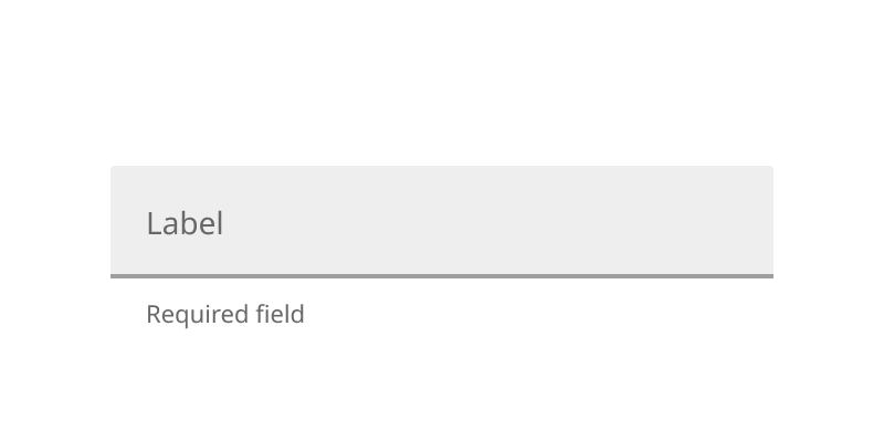
Use helper text to indicate an input is required

Show a ratio of characters used and total character limit for fields with character limits
Iconography
Iconography should be used sparingly and purposefully. Here are common text field and icon pairings:
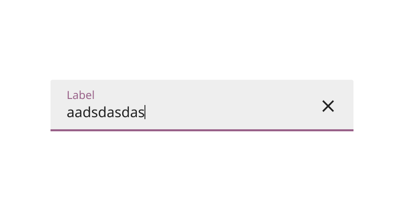
Include a clear icon to indicate an ability to clear the field when text is present
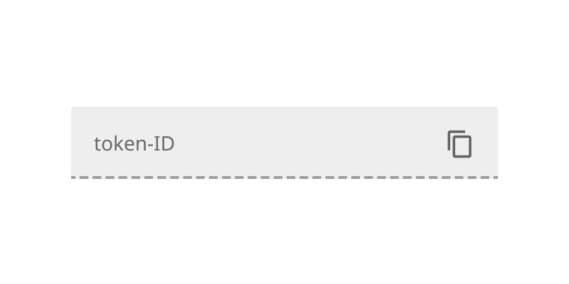
Include a copy icon to indicate information is able to be copied
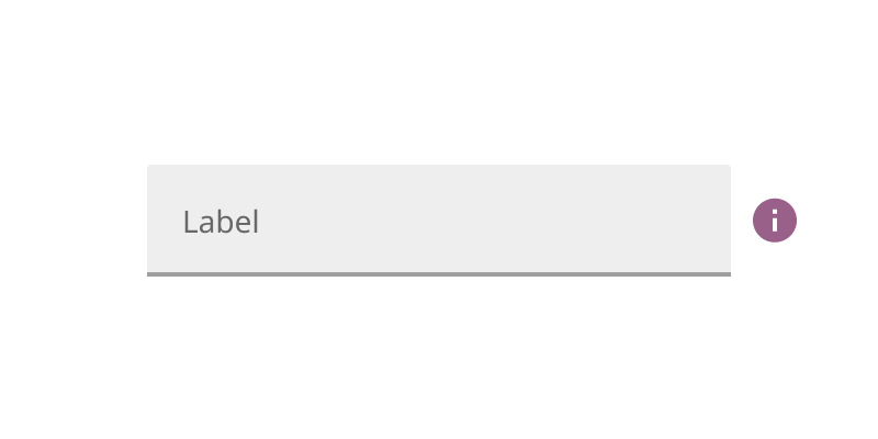
Include an info icon that reveals more information on hover or click
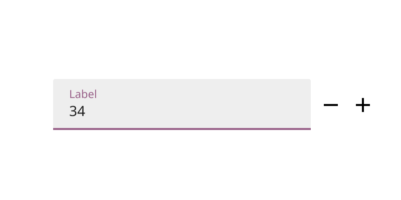
Include controls that can affect the the input of a numeric text field
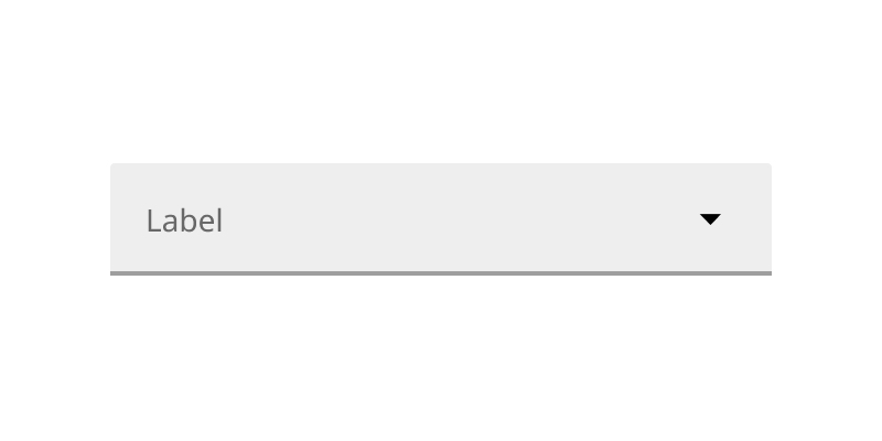
Include a dropdown icon to indicate the presence of a nested menu component
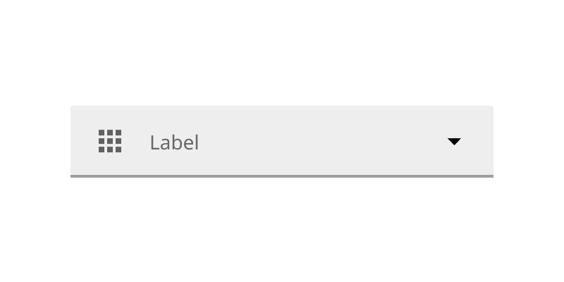
Include an icon signifier to the left of the label to indicates a theme or category of the dropdown menu options
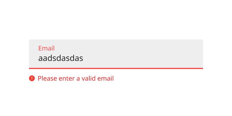
Error text
Error text appears when there is an error detected with the user's input. Error text should replace helper text where applicable.
- Error text is written in sentence case
- Error text should describe specifically how to resolve the error
- Error text disappears when the error is resolved
- Error text should be paired with an error icon to aid visibility for colorblind users
Be specific as possible about how to resolve the error
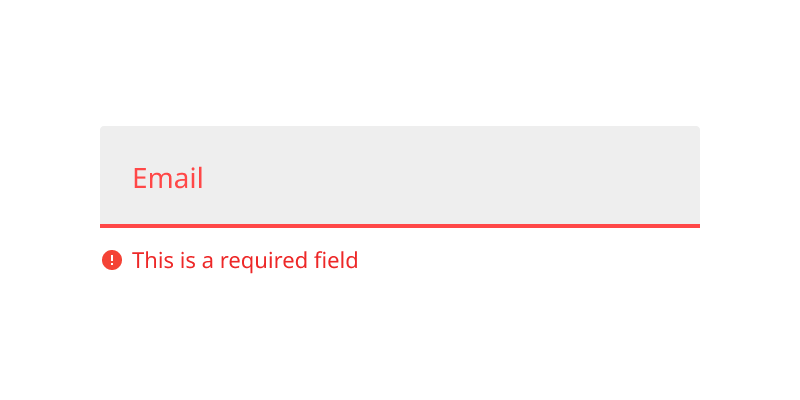
Provide general error text for nonspecific errors
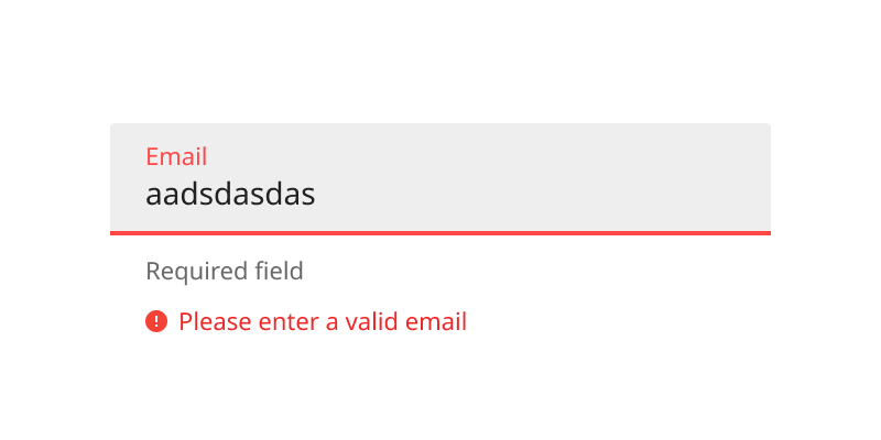
Stack error text below helper text
Advanced configurations
Text fields can have a few behavioral exceptions:
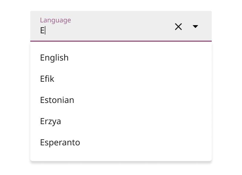
Prompt autocomplete suggestions to help users navigate lengthy dropdown menus
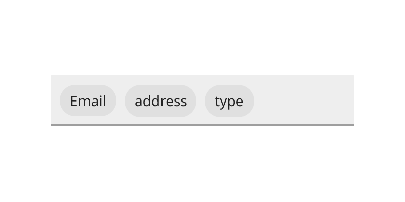
Display multiple selections as chips
Specifications
- Height: 54px
- Min width: 252px
- Corner radius: 2px
-
Fill color:
palette.grey.v_100 -
Bottom stroke color:
palette.grey.v_700 -
Bottom stroke focused color:
tokens.primary -
Label text color:
palette.grey.v_700 -
Focused text color:
tokens.text