Overview
Menus allow users to make a selection from a list of options. We use two types of menus: Dropdown and Filter.
Dropdown menu
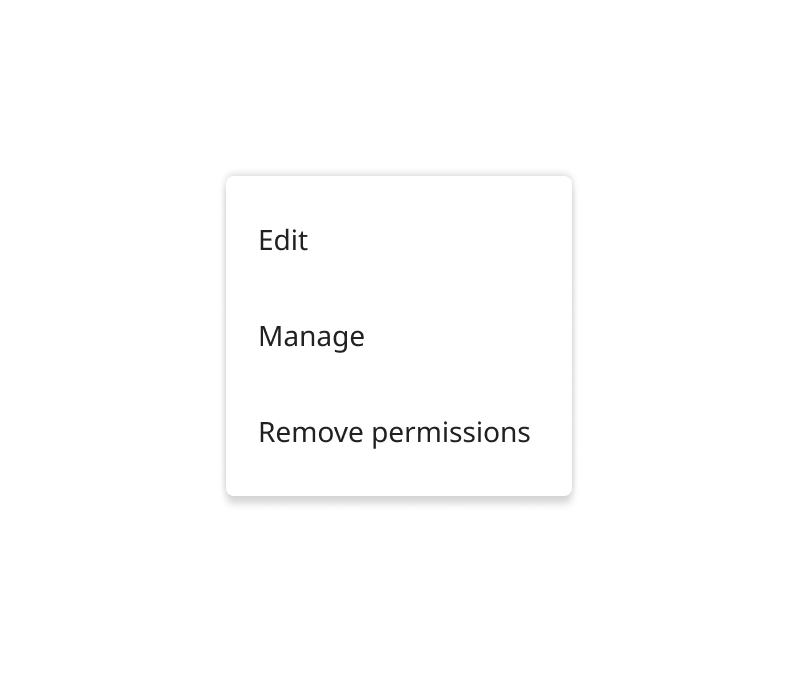
Allow users to discover and access complex actions. They can be generated from buttons, icons, and in some cases by right-clicking a location.

Filter menu
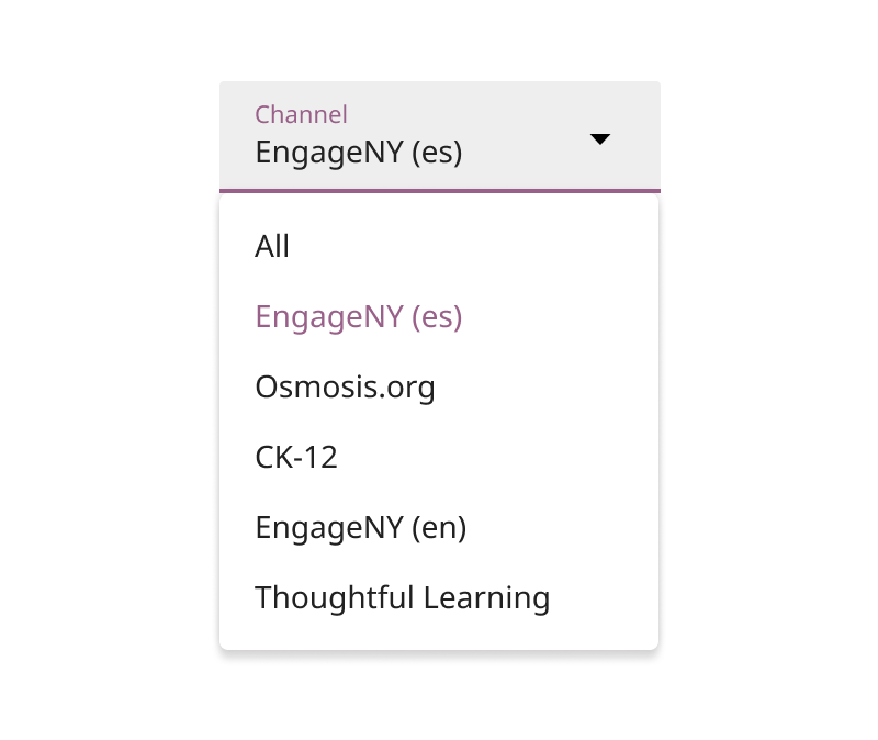
Filter menus allow users to filter information by selecting from a long list of options. They can be generated by clicking a text field.

Menu text
- Menu options can be user-generated text
- Menu text is 2-3 words by default
- Menu option text may have a disabled style
✔ Do

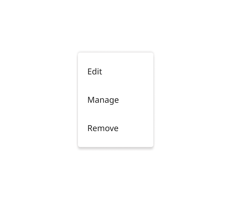
Minimize text and rely on interface clarity
✘ Don't

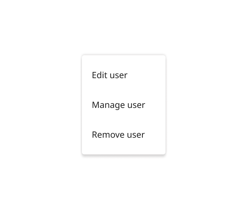
Write repetitive menu option text
Layout
- Menus appear above all other UI elements
- Menus appear directly below the element that generated it
- Menus do not move from their original location when scrolling through the page
- Menus should never touch the edge of the browser screen. Apply an offset of 8px.
Guidelines
- Menus can contain icons
- Menus can have dividers to group relevant options together
- By default only one menu item can be selected at a time
- Multiple menu options can be selected in special cases
✔ Do
Use iconography as a visual aid for important actions
✘ Don't
Use repetitive iconography in filter menus
Specifications
- Min width: 128px
- Menu elevation: 4dp
-
Background color:
tokens.surface -
Option text color:
tokens.text -
Option text hover color:
palette.grey.v_200 -
Iconography color:
palette.grey.v_800
Dropdown menu
- Width: matches the width of the longest text option
- Menu option height: 32px
Filter menu
- Width: width: matches the width of the text field that generates it
- Menu option height: 48px