Typeface
Kolibri is translated into upwards of 30 languages, and the public content library contains resources in dozens more. There is no way to know in advance what text will be displayed, or which fonts are already available on the user's device.
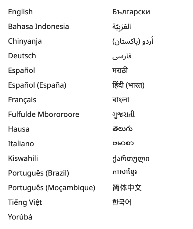
To work around this challenge, products in the Kolibri ecosystem use the open source typeface Noto Sans maintained by Google. Noto includes a wide range of fonts that cover an enormous number of languages, scripts, and glyphs.
Kolibri must work offline, and therefore the design system has some special logic for loading fonts as-needed from the device. Studio on the other hand is in the cloud and relies on the Google Fonts API to load Noto.
Globally-available styles
The design system provides a set of reusable style constants, snippets, dynamic values, and helper styles.
Constants and snippets
Constants are made available as
SCSS variables
and snippets are made available as
SCSS placeholder selectors. For example, we provide a constant called $radius (defined as
4px) and a placeholder selector called %dropshadow-2dp which
creates a 2dp drop shadow. These can be used to style an element by importing the
definitions file:
Use these by importing the design system's definitions.scss file. For example,
this HTML and SCSS in a Vue template:
<div class="box">Hello!</div>
      @import '~kolibri-design-system/lib/styles/definitions'

      .box {
        @extend %dropshadow-2dp;

        border-radius: $radius;
        text-align: center;
      }
can help easily reproduce styles like:
Dynamic values
Kolibri supports dynamic theming and colors update at runtime rather than being fixed SCSS constants. They are available in two forms:
-
As CSS variables (
--tokens-*,--brand-*,--palette-*) for use in<style>blocks and SCSS files. Reference them withvar(--name). -
As reactive objects on every Vue component instance (
$themeBrand,$themeTokens,$themePalette) for use in computed styles and inline:stylebindings.
For more information see the Colors page .
Global and helper styles
styles/common registration during the
installation step
globally exposes the following:
.visuallyhiddenclass: hides an element visually but keeps it accessible to screen readers- Global styles for page background, text color, text selection, focus outline, and print, using the theme CSS variables
- Every theme CSS variable at its default value, so they resolve when the page first renders, before the theme plugin has run. These come with the helper styles rather than the global styles, so they are always registered.
Focus outline
We provide a consistent, high-contrast focus highlight, using the
--tokens-focusOutline
CSS variable. The global styles apply it to focused elements that match
:focus-visible, which the browser decides.
trackInputModality()
overrides that decision. Its disableFocusRingByDefault option defaults to
true, which adds the rule
body:not([modality=keyboard]) :focus { outline: none; }. That rule outranks the
global styles, so the outline appears only during keyboard navigation, and
:focus-visible makes no visible difference. Pass
disableFocusRingByDefault: false to let it decide again. This documentation
site uses that setting.
CSS can only outline the element that has focus. When the outline belongs on a different
element, use the $coreOutline computed property available on Vue instances. It
returns the outline style while the user navigates with the keyboard, and
outline: none at other times.
Elevation and shadow
Kolibri products use a system of elevation based roughly on Google's Material Design. Material introduces the idea that UI container elements (menus, modals, side-bars, etc) exist on a particular "elevation" on the page, which defines which one is visible when they overlap.
Drop shadows
In the real world, the shadow an object casts is often a physical manifestation of its elevation.
The design system provides a set of pre-defined SCSS placeholder selectors which allow consistent application of realistic-looking shadows: 1dp, 2dp, and 6dp:
Follow the guidance below to decide what depth to use for a drop shadow:
- 1dp
- containers, panels, controls
- 2dp
- cards, app bars, buttons, menu, tooltips, snackbars
- 6dp
- modals, card hover
This can be achieved by with the dropshadow helpers:
      @import '~kolibri-design-system/lib/styles/definitions'

      .box-1dp {
        @extend %dropshadow-1dp;
      }

      .box-2dp {
        @extend %dropshadow-2dp;
      }

      .box-6dp {
        @extend %dropshadow-6dp;
      }
Z-indexes
CSS z-index is sometimes used to determine whether some element will show in
front of or behind overlapping elements. A common challenge is that
z-index values get set to arbitrary numbers, which leads to ever-increasing and
bizarre values to force one element to display over another.
In Kolibri products we try to use the conventional elevation dp values shown above as
default z-index values. This ensures that, for example, a custom menu should
always show below a custom nav drawer even if there was no coordination between the authors
of those components.
Note that it is not encouraged to set a z-index on every element.
There are many reliable ways in CSS to show one item over another and
z-index is often used a last resort.
The diagram below (with credit to Google) shows the conventional elevations:
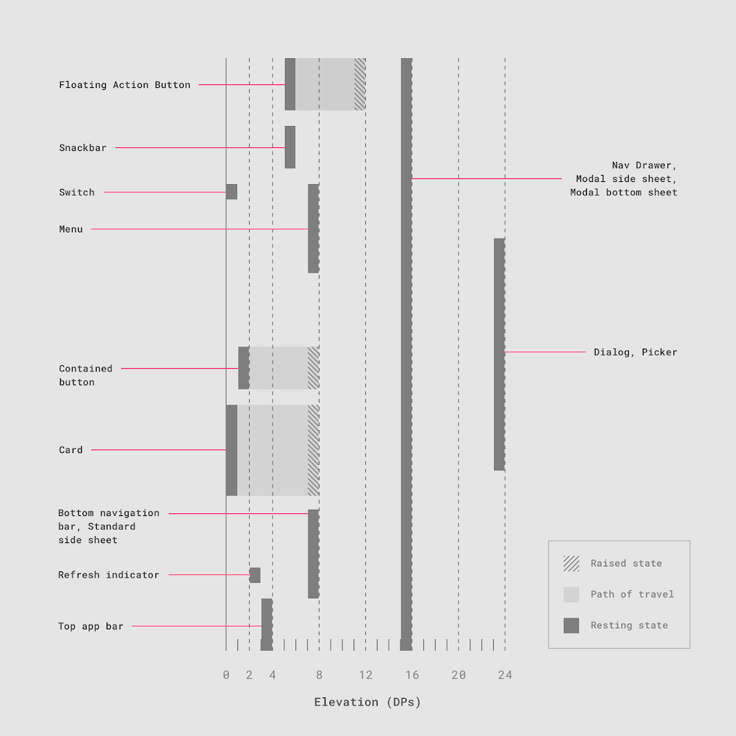
Applying these conventions consistently helps build components that look and interact with each other in predictable ways.
Easing and timing
Rapid visual transitions for elements that move or change state help users understand what is happening on the page and add a level of polish that makes the app feel smooth and responsive:
Easing functions should be applied to every visual state transition, including color changes.
We have a "standard" easing curve as well as curves for for outgoing items (accelerating)
and incoming items (decelerating). Apply a transition with default duration
$core-time and use one of the SCSS placeholder selectors:
%md-standard-func%md-accelerate-func%md-decelerate-func
For example:
      @import '~kolibri-design-system/lib/styles/definitions'

      .ease:hover {
        @extend %dropshadow-6dp;
        @extend %md-standard-func;

        cursor: pointer;
        transition: all $core-time;
      }