Overview
Filters allow users to show or hide data from view and can also be used to narrow down displayed information to a specific criteria. Filters can be placed in interfaces with search functionality and can accompany other components and patterns like lists and data tables.
Components
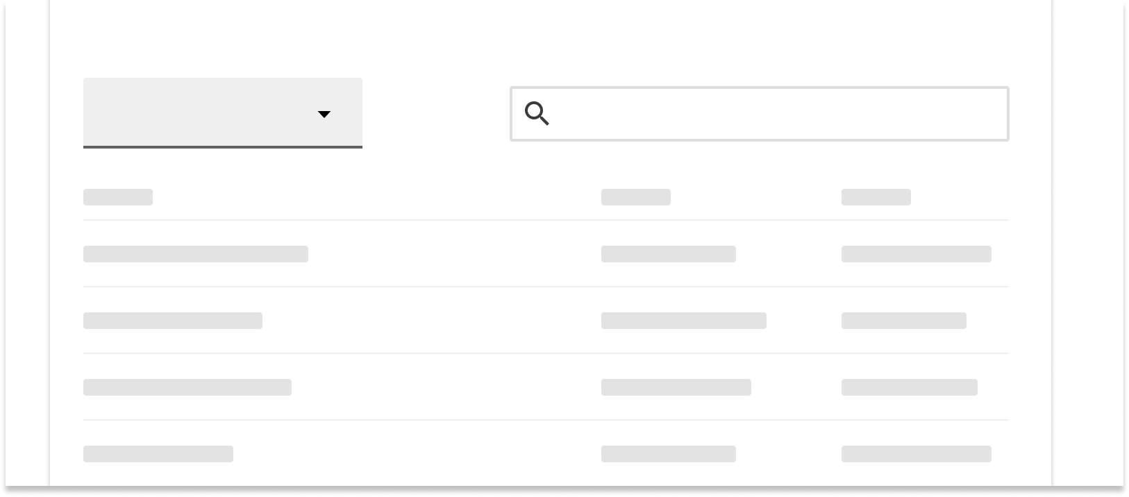
Dropdown menus
Use dropdown menu filters when you would like users to filter by one criteria at a time and when there are less than 10 options to select from.
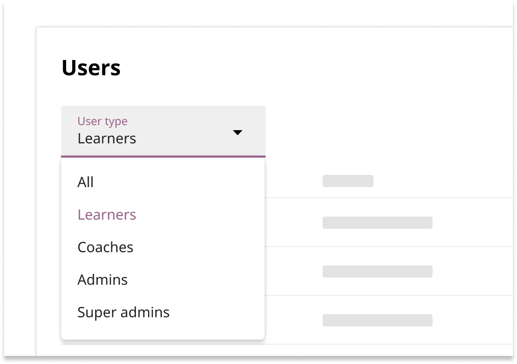
Dropdown menu filters use the menu component and are usually left-aligned at the top of a list or table. The label should specify what type of information is being filtered.
Text input dropdowns
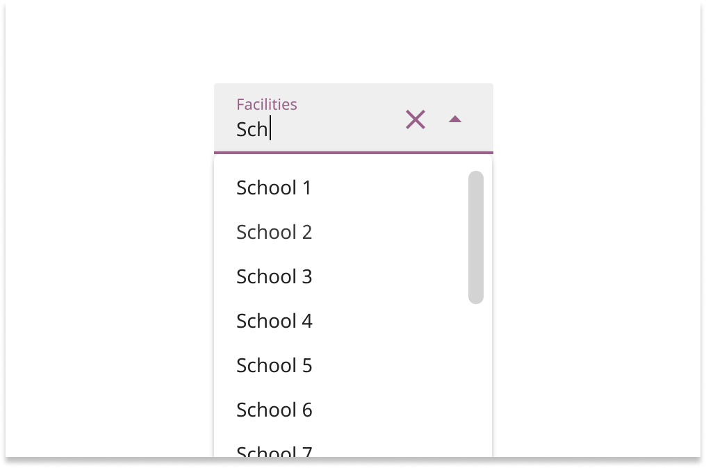
Text input dropdowns use the text field component. They allow the user to select from a list of options and quickly filter down from many options by inputting text. Use this component when there are at least 10 options to select from.
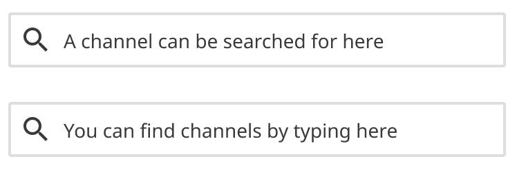
Text filters
Use text filters to help users narrow down lists or tables that contain many items. Text filters should be right-aligned above lists and tables.
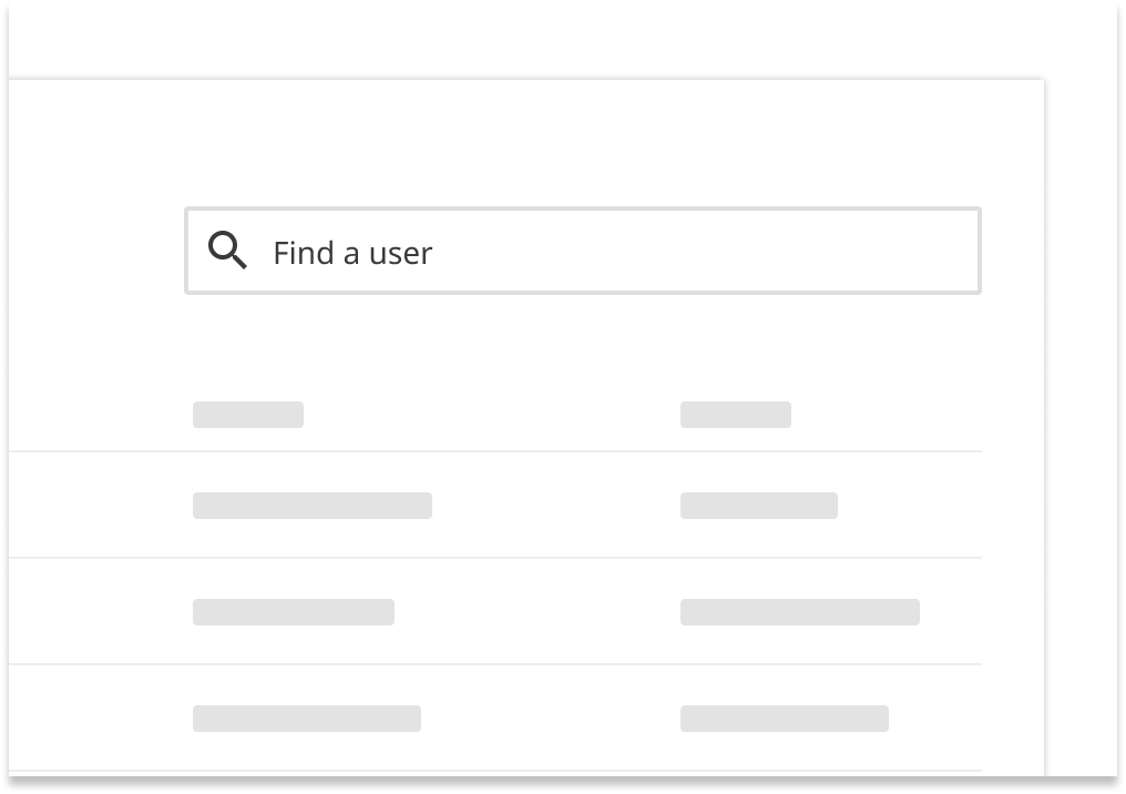
By default, results should update as the user types. If updating as the user types would cause noticeable performance and load time issues, then update the list of results after the user loses focus on the text filter.
Placeholder text should let the user know what data can be filtered when they input text. State this concisely in the imperative form.

Checkbox lists
Use a checkbox list if you’d like to allow multiple options within a category to be filtered for at once. They can also be used when you’d like to provide more visibility to the options themselves.
By default, the list of results should update as the user selects different checkbox options.
Frame the text of options concisely and as affirmative statements.


Behaviors
Any filters that have been applied should persist on refresh or browser back.
By default, data should be filtered by the “all data” option. However, pre-filtering to one or more options can happen in exceptional cases where doing so improves the experience.
Hiding vs disabling
If selecting a filter option would result in “0 results” being shown, that option should be hidden from the dropdown, hide the filter option. If all filter options in a dropdown would always result in “0 results,” hide the entire filter.
If one or more filters have already been applied, and combining remaining filter options would show “0 results,” those remaining filters should be disabled. If all potential remaining selections in a filter dropdown/section will show “0 results,” disable the entire filter section until the current filter sections are cleared.
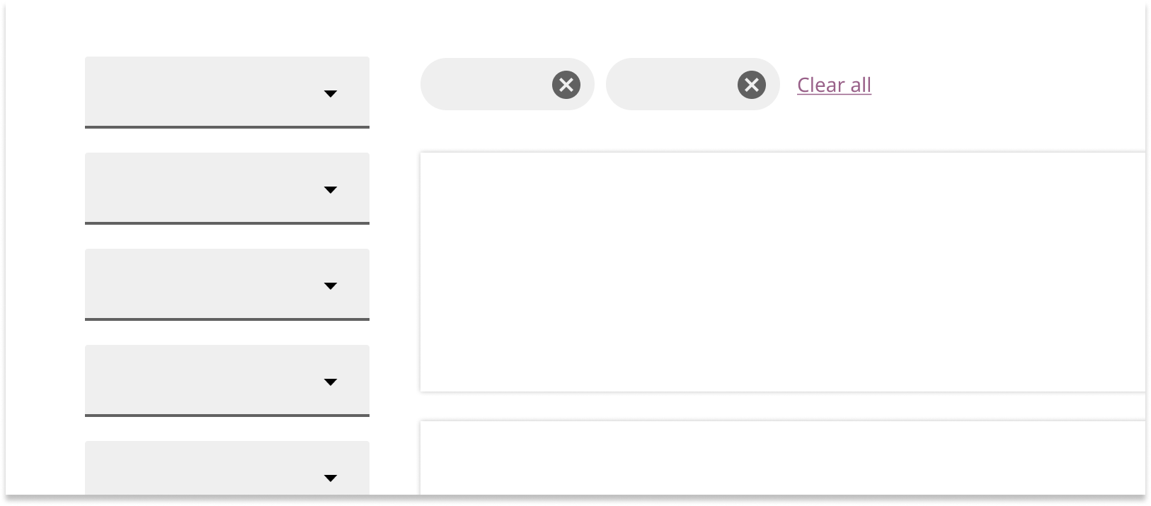
Filter groups
Filters can be flexibly combined in groups horizontally or vertically to create a more customized filtering experience.
Layout
Text filters and dropdown filters should be aligned in the same row when placed above data tables.
Filters can also be left-aligned for lists and search results. Use clearable chips to show which filters have been selected and offer the option to clear all selected filters.